Thursday 7 May 2009

Optix: Bontrust “Geldvermehrung”


This is a fantastic advert that I am very jealous of! When I was researching for my adverts for Barclays I had the idea of producing an animation using money and pound notes, but I fairly quickly dismissed it thinking it would be too hard to produce.
Optix however didnt and have created this magnificent origami world of money, the idea is to show the increase of money on the international market in connection with some kind of sexual relation! It works really well, especially with the change of music, the idea is great and well executed with the dollar bills, english sterling and chinese yen(?) representing the 3 figures. I'm just gutted I didnt think of it first!!!

http://motionographer.com/theater/optix-bontrust/

Wednesday 6 May 2009

Bloc Party - One Month Off


This is a great music video that inspired me to use fairy tales in my final major project, it is by a studio called Team DADDY and according to their site it only took two weeks to make! the idea is great and they have very cleverly comped over the top of Ray Harryhausens footage, creating a whole new feel and meaning to the cartoons. This video also reminded how cool the old fashioned Mother Goose cartoons were, all of which were painstakingly stop motioned by the master Harryhausen! I love old fashioned grainy look of the video too even though it has been modified in 2008.

Tuesday 5 May 2009

Mcdonalds Chicken Legend with Bacon


Chicken Legend with Bacon from McDonalds


I have added this video to my blog because of the brilliant way in which it creates a simple bike ride scene in the most amazingly complicated way, it uses a cyclist that is static and the scenery moves around him to create the illusion of movement, it is a method that is usually used digitally in '2.5d' to fake the illusion of perspective, and as I have actually used this technique in my 'wolf' scene, this just shows me how much work I would have had to have done if I chose to do it for real! Although I would love to do a project like this for real in the near future definately!

Voiceovers ltd


As I was getting near the final stages of producing my adverts, I realised that I needed to get the voiceover done to accompany the sound, I already knew what my script would be as my whole idea has formed from my strapline "Get protected from the unexpected" I attempted to record it myself but was not impressed with the sound quality of my equipment and most of all not impressed with my voice on tape! so I decided that I was going to need to bring in a professional voiceover artist to perform it. I searched the net for agencies and listened to the samples they had to offer. I found one company that was based in the UK (Plymouth to be precise) called Voiceovers ltd. Hoping that it would 'do what it says on the can', I rang them up and spoke to one of their staff called Paul, I explained my project and that I was looking for a female, english, 20-40's, no strong accent, voiceover artist to perform my script and suggested a few names that I liked from the samples on their site. He said he would find out who was available straight away and that all I needed to do was send over an email of my script/needs to them.
About an hour later I was emailed back by Paul who said there was a woman available that afternoon, who had alot of experience and sent attached a sample. It was just what I was looking for so we agreed the fees and gave them the go ahead, later that day I received an email with the finished product attached in mp3 format (which I had asked for)
As I listened to it I found she had repeated it 3 or 4 times in slightly different accents/emphasise, although the first one she did I thought was the best. I have now added the voiceover to my adverts and it really does bring them to life, and makes them feel an awful lot more professional than if I recorded them myself, this has also taught me that subcontracting parts of your project out can be very beneficial, not only in proffesionalism as that would be how you would do it in a real brief, but in timescale too. Overall I found the service from Voiceovers ltd fantastic, very quick, helpful and professional and I would definately recommend anyone else to use them and would probably use them myself again too.
www.voiceovers.co.uk

Practitioners Report - Damien Gascoigne and Gillian Blease

For this section of my blog I am going to compare and contrast the processes and practices of two design practitioners who both gave lectures at Stockport College, they are Damian Gascoigne and Gillian Blease.

I chose these two because I felt they gave two of the best lectures over the past academic year, I thought they had great styles and relevant pieces of work and I thought they had a lot of interesting points to say. Gillian Blease was on the 17th October and gave a very professional and down to earth lecture and Damian Gascoigne was on the 13th March and gave a very funny and informative performance.

The first similarities I picked up upon from the two practitioners were their backgrounds, where they both came from print based design courses; Gillian Blease took a Typography course here at Stockport college before moving on to MMU to study a foundation in Art and Design. After completing this she headed to Newcastle University to concentrate mainly on Fine art.

Damien Gascoigne studied graphic design at Kingston polytechnic in 1984 (and later went back to lecture there on animation) but when he finished and worked as an illustrator for 5 years he decided that unlike Blease, he wanted to move into moving image. In a way I have taken a similar path to Damien because I started out in graphic design too but felt I wanted to move into moving image as I found that more exciting and interesting.


After her education Gillian spent 6 weeks living in Japan that she said highly influenced her work, and then moved to London to try and make a name for herself and managed to get a contract job working freelance for the guardian thanks to the help of ACME, which is a support group for artists looking for residency in London.

Gillian explained in her lecture that sometimes collaborating with different people on projects sometimes leaves you with no creative freedom as she found from working on the South Bank Literature Festival in which she says she "felt like a puppet" because the creative team already had a strict idea of what they wanted. I similarly have come across this problem first hand in my old job producing posters and magazine layouts for a company that already had (very dated) set templates for how they wanted things to look. I found that you just have to accept the fact and just do the work how they want it, even if you think it looks bad!


Similarly Damien Gascoigne worked as a freelance illustrator, but unlike Blease who liked working alone, he missed the buzz and dialogue of working in a team so after that he moved in to animation and worked as a freelance director for the company Picasso Pictures. He mentioned that after 25 years working for himself, he wouldn’t be able to adjust to working for someone else. I think this is an interesting issue that I need to think about for my career because I have thought about trying to go along the freelance director route but I think I wouldn’t be able to do that straight away, I would definitely need to get a few years experience under my belt first, also I would rather work with other people in a studio like Gascoigne does at Picasso Pictures because I think working with others around you is more productive and more influential as people can comment and give advice on things.


The two lecturers process of researching and finding inspiration also shows some similarities, Gillian mentioned that over the years she has collected a ‘library of visual information’ that she stores in big filing cabinets in her studio, and uses it for references when she needs inspiration.

Gascoigne has a wonderful way of finding and collecting inspiration as he refers to it as ‘working without working’ he says that something interesting happens all the time and that he just takes in ‘life’ all around him. He loves taking photos and especially loves drawing and doodling things in sketchbooks and notepads, he says he keeps a post-it pad by the phone because it is interesting to see what you doodle when you are not concentrating on it! And also he loves watching people, especially their hair, and their posture! He mentions that these features are very important in character design which I fully agree with after doing my project using little cartoon characters.


I thought it was really interesting to find out how professional designers do their research as it is something you don’t usually get to see, and I always thought that when I finished college and university I wouldn’t bother keeping and compiling research because you don’t exactly get marked on it like when you are on a course, but recently, especially after hearing Gillian and Damien talk about their methods I feel I will try and do more and be inspired by Gascoigne to make sketchbooks full of my random thoughts and doodles as you never know when they could come in useful.


Both Damien Gascoigne and Gillian Blease have picked up awards for their work along their careers, Damien’s filmCareful(2005) won first prize at the London Animation Festival (2006) and was shortlisted for best film at numerous other festivals including the Australian International Film Festival in Adelaide.

Blease won a competition for her piece "lists found" that won her her very first computer and which meant she could learn and experiment using the program Adobe Illustrator. Her progression from fine art/illustration to more digital inspiration spawned from this and I think definitely in a good way, and has got her commissions with big name brands like Barclays, Waitrose and the Guardian.


Where Gillian Blease liked to produce images using the computer, with a smooth, colourful and simple style, Gascoigne had a different view on how he produced his work he says “A computer never gave me an idea!” and likes to use hand drawn methods as much as possible in his work. I personally like to use both of their styles in my work, possibly because I don’t know what my distinctive ‘style’ is yet or maybe just because I like producing a range of different things that have different feels to them. I don’t think either of their work is better than the others because they are so different, they are both very good at what they do.


I think that overall I have compared and contrasted the practices and processes of the two designers, I have found that even though they may have ended up in different fields of design they both generate idea's using very similar methods, and that the way they execute those ideas are very different. I was very impressed with both lecturers and I think I have absorbed some of the knowledge that will help me in my researching and production and making decisions in my career also.

Saturday 2 May 2009

Saw this and thought of Jordan!

Just found this animation on Nizmlab.com, it is french and has subtitles but you can make out what it is going on about without them. It shows a day in the life of an ordinary man going through his daily routine whilst encorporating his favourite drink into everything he does. I think it is really funny, especially at the end when he starts to lose it! The animation style is nice and I like the way it uses coffee stains to make up the textures towards the end.

Friday 1 May 2009

Midea Effects

Came across this company on vimeo, from Brazil they have a great selection of work, and there information on the profile says (Translated from portuguese!):
"The MidiaEffects is a studio of digital convergence that initiated its activities in year 2000. We are specialized in Web, Video, Finishing, New Medias, In - He measured and what plus you he can imagine. By the way imagination is what better it defines the MidiaEffects."

Continuidade (Continuity) from midia effects on Vimeo.


This is one piece they have produced called Continuity, from what i gather it is a promotional piece, I really like the pace and flow of the animation and really matches well with the music.

Lar Emanuel Carreteiro Beneficente from midia effects on Vimeo.


Here is another piece they have done that strangely I dont think works that well! I am not sure what it is advertising because its in portuguese but I believe that just from the visuals and sound effects of an advert you should be able to get an idea of what it is advertising, with this I have no idea! also I dont think that the mixture of styles works either, the 3d sections work well but then suddenly they have decided to use a 2d crayon drawn style sky that I think looks really out of place. I think this is somehing to watch out for in my own work because I always like to see if there are ways of using multiple media methods in one piece but after seeing this I will definately try and be more aware of what works and what doesnt.

Notebook by Evelien Lohbeck

Noteboek from Evelien Lohbeck on Vimeo.


Came across this on Motionographer today, I have seen this sort of technique alot recently as it seems to be very popular using paper/drawn elements and using stop motion to make it look like shes manipulating it. This piece works perfectly and uses so many ingenious ways of using a notebook, my favourite is the mirror page, I presume must have been rotoscoped over a real mirror. It is a similar process to what I used for my Tomorrows world advert, and I am gutted I hadnt come across this earlier as I think it would have given me a bit more inspiration to really think out of the box with the paper/reality crossover.

Al Balad Newspaper Spots

Came across these spots for a Newspaper called Al Balad based in Lebanon. It is directed by renowned director Carlos Lascano and they use the main slogan 'Size doesnt matter!' promoting that the paper now has a new smaller size, and uses famously short historical figures to create 3 very funny adverts. I really like the 2.5d style of it as well as the illustrative style using characature like faces, I also think that the style maybe takes references from Terry Gilliams animations done for Monty Python. I also like the clever fact that because these main chatacters are so small you never actually see there faces because they are always of screen, this adds to the visual idea behind the brief.


AL BALAD - Napoleon from Carlos Lascano on Vimeo.


AL BALAD - Ghandi from Carlos Lascano on Vimeo.

Thursday 30 April 2009

Toshiba Timesculpture


This advert interests me because of the technique it uses to shoot it. It is the same technique used to shoot the 'Neo bullets' scene in the Matrix, and uses a room full of cameras creating a 360 degree view on a rig of scaffolding. The advert works really well with the white crisp room and the colourful people moving around in the middle, there slogan is redefining the way you watch tv because the content we watch is changing all the time. I think the idea works for this advert very well.

Top 10 Lies Told to Naive Artists & Designers

I found this interesting article whilst researching for my Issues and practices text, it is quite light hearted and funny in places but it does also have some good advice of what to look out for when pitching to clients, after reading this I think I would be slightly more savvy to clients trying to rip you off:

Top 10 Lies Told to Naive Artists & Designers

Mark W. Lewis © 2005

1 "Do this one cheap (or free) and we'll make it up on the next one."

No reputable business person would first give away their work and time or merchandise on the hope of making it up later. Can you imagine what a plumber would say if you said "come in, provide and install the sink for free and next time we'll make it up when we need a sink." You would be laughed at! Also the likelyhood is that if something important came along, they wouldn't use you.

2 "We never pay a cent until we see the final product."

This is a croc, unless the person is leaving the door open to cheat you out of your pay. Virtually every profession requres a deposit or incremental payment during anything but the smallest project. Once you have a working relationship, you may work out another arrangement with a client. But a new client should not ask you to go beyond an initial meeting and, perhaps some preliminary sketches without pay on the job!

3 "Do this for us and you'll get great exposure! The jobs will just pour in!"

Baloney. Tell a plumber "Install this sink and my friend will see and you'll get lots of business!" Our plumber friend would say "You mean even if I do a good job I have to give my work away to get noticed? Then it isn't worth the notice." Also the guy would likely brag to everyone he knows about how this would normally cost (X) dollars, but brilliant businessman that he is he got if for free! If anyone calls, they'll expect the same or better deal.

4 On looking at sketches or concepts: "Well, we aren't sure if we want to use you yet, but leave your material here so I can talk to my partner/investor/wife/clergy."

You can be sure that 15 minutes after you leave he will be on the phone to other designers, now with concepts in hand, asking for price quotes. When you call back you will be informed that your prices were too high and Joe Blow Design/Illustration will be doing the job. Why shouldn't they be cheaper? You just gave them hours of free consulting work! Until you have a deal, LEAVE NOTHING CREATIVE at the clients office.

5 "Well, the job isn't CANCELLED, just delayed. Keep the account open and we'll continue in a month or two."

Ummm, probably not. If something is hot, then not, it could be dead. It would be a mistake to *not* bill for work performed at this point and then let the chips fall where they may! Call in two months and someone else may be in that job. And guess what? They don't know you at all.....

6 "Contract? We don't need no stinking contact! Aren't we friends?"

Yes, we are, until something goes wrong or is misunderstood, then you are the jerk in the suit and I am that idiot designer, then the contract is essential. That is, unless one doesn't care about being paid. Any reputable business uses paperwork to define relationships and you should too.

7 "Send me a bill after the work goes to press."

Why wait for an irrelevant deadline to send an invoice? You stand behind your work, right? You are honest, right? Why would you feel bound to this deadline? Once you deliver the work and it is accepted, BILL IT. This point may just be a delaying tactic so the job goes through the printer prior to any question of your being paid. If the guy waits for the job to be printed, and you do changes as necessary, then he can stiff you and not take a chance that he'll have to pay someone else for changes.

8 "The last guy did it for XXX dollars."

That is irrelevant. If the last guy was so good they wouldn't be talking to you, now would they? And what that guy charged means nothing to you, really. People who charge too little for their time go out of business (or self-destruct financially, or change occupations) and then someone else has to step in. Set a fair price and stick to it.

9 "Our budget is XXX dollars, firm."

Amazing, isn't it? This guy goes out to buy a car, and what, knows exactly what he is going to spend before even looking or researching? Not likely. A certain amount of work costs a certain amount of money. If they have less money (and you *can*) do less work and still take the job. But make sure they understand that you are doing less work if you take less money that you originally estimated. Give fewer comps, simplify, let them go elsewhere for services (like films) etc.

10 "We are having financial problems. Give us the work, we'll make some money and we'll pay you. Simple."

Yeah, except when the money comes, you can expect that you will be pretty low on the list to be paid. If someone reaches the point where they admit that the company is in trouble, then they are probably much worse off than they are admitting to. Even then, are you a bank? Are you qualified to check out their financials? If the company is strapped to the point where credit is a problem through credit agencies, banks etc. what business would you have extending credit to them. You have exactly ZERO pull once they have the work. Noble intentions or not, this is probably a losing bet. But if you are going to roll the dice, AT LEAST you should be getting additional money for waiting. The bank gets interest and so should you. That is probably why the person is approaching you; to get six months worth of free interest instead of paying bank rates for credit and then paying you with that money. Don't give away money.

Now, this list wasn't meant to make anyone crazy or paranoid, but is designed to inject some reality into the fantasy.

You are GOING to be dealing with people who are unlike yourself. Their motivations are their own and their attitudes are probably different than yours. There are going to be demands, problems, issues and all the hassles that go with practically ANY work/job/money situation. Too many times I see the sad example of someone walking in to a situation with noble intentions and then getting royally screwed, because what they see as an opportunity and a labor of love, the other party sees as something else entirely, not at all romantic or idealized, but raw and simple.

How can you deal with this stuff and still do good creative work? Good question. THIS is why an education is important. You learn, out of the line of fire, how to deal with the art at it's own level and also how to deal with the crap that surrounds it. You may have tough teachers and think that it can't be worse, but wait until a business person has a hundred grand riding on your art! Then you will know what "demanding" means. You will then thank all those tough teachers for building up the calluses that enable you to enjoy the job rather than just feeling like it is all a big waste of time!

In the end, working commercially, being a terrific artist is about 25% of the task. If that is the only part of the task that you are interested in, do yourself a favor. Don't turn "pro."

Wednesday 29 April 2009

Too many design graduates?


As I am rapidly approaching the end of my degree, I will be shortly looking for a job and try to get myself into the design industry, unfortunately for me thousands of other students will be thinking the same thing which means that there is an incredible amount of competition for the few jobs that are actually out there.

It is a very competitive industry and according to a UCAS poll a whopping 70 per cent of graduates coming from design based courses don’t go on to work in the industry, partly because they don’t want to, but mainly because the supply of graduates exceeds the number of jobs available.

The possible reason why so many people head for these sort of degrees is that they are labelled by some as a ‘soft option’ degree, as apposed to something like mathematics or engineering, and the fact of just having a degree under your belt will stand you in better stead for any job application you go for (usually) regardless of its sector. Personally I disagree with this stereotype as I believe people who don’t really have their heart set on working in design tend to either just do a foundation course or a diploma and then go and get a job elsewhere, or take a degree course and drop out before they graduate anyway.

Of course the current economic climate doesn’t help the matter either, with more and more companies cutting down on costs and some actually losing staff which is drying up some of the potential opportunities that were possibly available in the few years before.

Lots of design magazines write numerous articles about graduates trying to get jobs, in the August 08 issue of Computer Arts Lawrence Zeegan (p35) explains a few steps that could put you ahead of the pack:

Firstly, ‘Understanding the industry’, meaning researching what different jobs there are and where you think you fit in to this, find out the difference between an art director in an ad agency and one in a magazine publisher.

On our visit to Mainframe in London, Adam Jenns also talked to us about this subject and mentioned that aswell as doing research into the company you should adjust your showreel to match what they do, so if they are mainly a 3d company there’s no point showing them all your 2d animation or stopmotion work (unless obviously they have stated they want to branch out into other areas) and if they are a post production house there’s no point showing them all your interactive work.

The second point Zeegan mentioned was ‘Getting your foot in the door’, he says: “The very best way of getting started is to undertake placements- smart designers began the process as students, not graduates, but its never too late. Don’t look down on placements because you work for free- the reward will be getting your name and portfolio about town, as well as valuable work related experience and a true insight into designing in the real world.” Placements, internships and runners jobs can be a really good way of gaining experience and building up your skills and portfolio but I feel that from speaking to people and what I have read, that there are very mixed opinions on this way in. There are lots of articles and blogs including this one that tell horror stories of nasty companies taking on runners and unpaid interns, making them work for free, take advantage of them and never promoting them, although from what I understand some companies are ok and some are worth avoiding. Ex student Paul Greenwood for example had a good experience of being a runner at Post production house Double Negative in London. He was taken on after graduating and he really worked hard and learned a lot from the experience and then 6 months down the line he was offered a great opportunity in the match moving division which he had been learning.

Zeegans third point is ‘Making the right impression’ he writes: “When it comes to contact, whether its by email, letter or online application form make sure that every single word, sentence and paragraph is read through numerous times for poor grammar. …you are looking to work in communication design, so make sure you are communicating correctly!”

Something everyone has said when I have visited studios, Mainframe, Studio AKA, Double Negative and Nexus all said that to make the right impression you should make your portfolio easy to read and navigate, keep it simple and keep your showreel short, they will know that you’re a graduate so they will know that you might not have loads of work to chose from, so don’t make a long reel repeating the same clips of certain pieces over and over.

Overall after researching into the subject I think that it is possible to get a good job after graduation if I take the advise I have pointed out, but I need to be prepared to hunt around and research a number of companies instead of just diving right in like many students will no doubt do.

E4 E'stings Competition

As some of you are probably aware, or if not you will no doubt have seen them on tv, E4 had an E stings competition, where people could create there own versions of the e4 idents based around the logo, alot of the entries are then played on tv and you can vote for them online. Anyway the competition has ended and you can view the winners here. What I really like about the competition is the huge range of ideas people send in, the wackier the better! here are a few of my favourites:


The Shadow puppet one is my favourite at 1:16!!

Bupa advert


I saw this set of adverts a while back and after our trip to London, and Studio AKA, I found out that they produced them, I really like the way that they have very cleverly brought the simplest shapes to life through the slick animation and soundtrack they chose, This really interests me as a motion graphics designer as lots of the work I have done requires bringing an object or character to life, for example my Dave ident that used letters, using the same principle movements as the Bupa advert. I think this set of adverts shows exactly what it takes to be a top animater/designer, being able to bring absolutley any object to life and make it enjoyable to watch. It also reminds me of the lost tribes of new york video I posted earlier as that uses the same concept.

Friday 24 April 2009

AndWhyNot Photography

I discovered this guy when I was working on my competition brief when i was looking into lightwriting. He is a proffessional photographer who makes a living shooting weddings and other special events but his passion lies in shooting night photos, especially using cars and lights. He prides himself on the fact that almost all of his pictures he takes now are straight out of the camera and not messed with in photoshop or iphoto etc. which personally I think is very impressive because it is easy enough to take an ok photo and make it look great by manipulating it but it is a real skill to produce straight from the camera, I know this from trying to attempt the same results as his night photos, myself using torches, led lights, glow sticks etc! I think he has a similar style to Andrew Brookes who I wrote about earlier on in this blog, here are some of his photos, I love the use of light in this first photo as he points a torch at the floor whilst shooting on long exposure, and walked round the car to make the ground glow, this really brings the focus point to the middle of the bonnet, and the cars driving past have added to the composition to keep it balanced. This has really influenced my work as I love taking photos and trying to capture the flourescent colours 'AndWhyNot' seems to manage. Now I like to take photos that look out of the ordinary or have a different point of view.

CGart


Someone in class told me about this website ages ago and I think it is a great source of talent and inspiration, it has a very easy format of just having thumbnails of peoples work that is regurlarly updated, After Andy Lyster told me you could submit your own videos for entry I recently submitted my Tomorrows World advert to the Administrators to see if they thought it was good enough to be added, and a week later I was very pleased to see that it had, since then my advert has had over 550 hits on my vimeo page and also lots of contact requests and 'likes', and I would recomend anyone to do the same with their videos.

My Vimeo Page


A few months ago I decided to join Vimeo and put a few of my videos up on it, at first I thought it was just another video hosting site like youtube but after a few days of being on it I realised that the work on there is mostly very creative and professional, this is possibly because it isnt as well known outside the design industry as youtube so there isnt videos of absolutely anything posted up. Also I found that the video quality is much superior to youtube and other similar sites although the videos I find often tend to stop half way through because of buffering (does anyone else find this? or is it just me?)
I also found that there is lots of great groups and communities of creative minded people and I have joined a great group called 'Everything Animated' that updates all the time with new videos of creative talent. Here is my Vimeo Profile: http://vimeo.com/user1349965

Thursday 23 April 2009

The Quiet Revolution

Something I feel I often overlook in my work is type, and typography design. Claire Scully of thequietrevolution.co.uk is someone who definately does not have this problem, making some great compositions solely from a few words or an interesting self designed typeface. Her type is very illustrative which I like and I think that her work has inspired me to think about type alot more in my work and believe that the writing can make a piece of design instead of just being an add on at the end.

Chris Buzelli

I discovered the work of Chris Buzelli when searching on StumbleUpon, he is an illustrator from Chicago who has produced lots of weird and wonderful images for the likes of big names like; Rolling Stone magazine, the New York Times and Playboy. I am really interested in illustration and am always looking for inspiration for my work, I really like his use of scale in his pieces as the cartoon like proportions seem to enphasise the focus point of the image. His medium also looks quite old fashioned as many illustrators these days create computer generated images I like that he still paints and draws as this is something I like to do in my work also. Below are a few examples of his work:

Subprime


subprime from beeple on Vimeo.

Subprime is a video by Mike Winkelman trying to show Americas tendency towards over-consumption, and the housing crisis. The animation is done using Cinema4d and has a similar style to Jonny Kellys stopmotion piece The Seed with its polygon style elements and plain block colours. I like the design of the piece because it isnt mega realistic like alot of 3d is these days, and I like the camera vantage point too, rotating the same spot through each transition.

Amazing Paper Creations!


A while ago I came across an artist/sculptor called Peter Callesen from Denmark who creates amazing works of art using only pieces of paper, his choice size is mainly A4, which is similar to my work as I always start an idea using A4 paper, he then crafts and cuts the pieces into beautiful works of 3 dimensional art. I love the way all his work is so clean and precise, the attention to detail is what makes these pieces so pleasing in my opinion. His work ranges in difficulty also, but always has a suitable title that brings the work to life and gives it a meaning, for example "Big wave moving towards a small castle made of sand"(2005) which is fairly simple but very effective, whereas "Fall" (2008) is alot more complex and has a double meaning, playing on the word for autumn and a man fallen.
He has also done lots of installation work, stuff outdoors, on water and even in ice! I think his work has influenced me to take more attention to detail in the pieces I create,

Tuesday 21 April 2009

Jetblue


Seat Monster from JetBlue on Vimeo.

Lovely 30 second advert for the airline Jetblue, animated by AAO (Against all odds) and Blacklist, Playing on the idea of having no legroom on airoplanes and the seat in front of you being your worst enemy! I really like the smooth animation style and the transition from one scene to another falling through the luggage compartment. I want to try and use some cool/unusual transitions in my final major project and as my adverts are also going to be 30 seconds long I will try to incorporate the fast pace to get across my message.

Monday 20 April 2009

Close up photography

Something that has always interested me is photography, especially shots that show something you would not normally see or in a different way. I always try and take photos of things I think might make interesting images and although im no proffesional I think sometimes I get some good results. I managed to capture some images of a fly on my kitchen window a few weeks ago that really show some interesting details and colours that you would never notice otherwise like the red and gold on its head, almost looks like it was wearing a roman helmet, could be a good idea for an animation showing a swarm of flies as roman soldiers????/


Also I found a dead wasp in my conservatory so I put it on a white piece of paper and lit it from above, I think this looks very strange almost like an alien autopsy, you can see all the tiny hairs o it and the colours under the light really stand out.


Also here is photo I shot a few months back when it was still cold, it shows an icicle/snowflake hanging from my wheely bin lid. There were lots of other photos like this that I cant seem to find that looked abit like faces

Memento

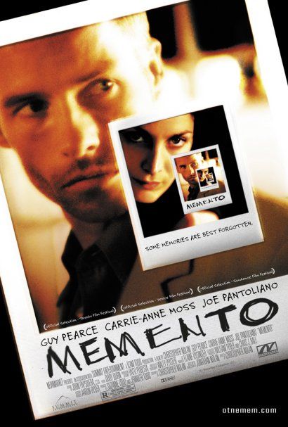
I recently watched the film Memento for the first time the other day, it features Guy Pearce as Leonard, suffering from short-term memory loss, uses notes and tattoos to hunt for the man he thinks killed his wife, The reason I think this film is interesting is because of the way it is shot, it does not follow the normal linear story layout, it shows scenes in the wrong order to show that he has short term memory loss and it makes it seem as if the audience does too. I think this would be a really good idea to keep in mind for my work doing animations as it just makes it more interesting to watch and keeps the audience guessing.

Extreme Shepherding!!!

My dad showed me a link to this the other day, it is a viral advert for Samsung LED tvs, I think this is extremely funny and amazingly well choreographed (although I think some parts may have been faked like the giant sheep walking at the start!) it uses sheep herded around a large field with LED suits strapped to their backs and then the footage is sped up in places to make it look like computer games and fireworks etc, I really like these kind of projects as they are so creative and must be an awfull lot of fun to shoot instead of just faking it in 3d sat at a computer!

Wolf and Pig

I was recently browsing on Motionographer and saw the title 'Wolf and Pig' and thought that could be interesting for my project for the 3 little pigs, anyway after watching it I was amazed at the 'double stopmotion' technique, I think it really works very well. It is made by a japanese student named Dokugyunyu and uses 1300 printed pictures of a guy in a wolf mask chasing a paper mach pig round a park. The pictures are then displayed in stop motion apearing in his flat moving along the walls and through each room, I really like the interaction between photo and surrounding for example where the pig jumps into the swimming pool the surrounding shot is in his kitchen and it creates the illusion he is swimming across the kitchen sink. It is quite a simple technique but is executed perfectly to make a very enjoyable watch.


Magical Trevor vs 118 247 Yell.com

Recently I was watching tv and I came across an advert for Yell.com and it instantly reminded me of a bizarre old flash cartoon I saw a few years ago called Magical Trevor!, I searched for the videos on youtube and watched them both and they are almost exactly the same! at first I thought the Yell.com ad was a blatant rip-off of Trev but after researching on the net it turns out they were done by the same guy and even features trev in the advert. Apparently after the marketing guys at Yellow pages saw the Magical Trevor advert they signed up Jonti Pickering the animator of the cartoon and commisioned him to rework it to their 'Directory Heaven' campaign. I think this advert is irritatingly catchy, especially the song, I am not really a fan of the look of it, I think it is too bold and plasticky(?) but I think it works well for the target audience, and it has obiously been a success because the 118 247 business directory enquiries service is up an unprecedented 70 per cent!!!


Friday 17 April 2009

Let it Shine


This is a very clever advert for Honda made by Weiden + Kennedy promoting the affordable and green Honda Insight, The slogan being Let it shine, it uses hundreds of cars all parked in a field at night flashing their lights in time to create a Dot-Matrix style animation. This style is becoming increasingly popular again, as is the pixelated style graphics you would have seen on early sega and nintendo consoles. I think its being used again as it has a retro, or 'old school' feel to it, just like some fashion trends of the current time. I think the advert works really well especially how it gradually turns into daytime and you can see all the cars lined up, it uses the same technique also as adverts printed on football fields so that the ads dont look perspective and fade off into the background, they look like they are standing up, in this case it makes the cars look like they form a perfect rectangle, but at the end of the advert you can see how they were arranged.

Tuesday 14 April 2009

Thinking Inside The Box!


This is an advert that is airing at the moment for Jordans Country Crisp cereal, it is produced by National television; a trio of highly talented designers from Los Angeles, Brumby Boylston, Chris Dooley and Brian Won who have produced lots of top quality adverts for big companies such as Honda, Currys and American express. There brief for the cereal advert was to 'think inside the box' which is what they based the whole idea around 'inside the cereal box' I really like this because not only have they just produced a visually pleasing spot that they just thought would look good, they have an underlining message that was the starting point and they haven't strayed too far from the original idea they were given.
From looking on their website they had a few versions that didnt make the final edit but they have posted a few images of what the other scenes would have looked like (below);


http://www.natl.tv/showreel/

Friday 10 April 2009

Yves Geleyn

Yves Geleyn grew up in Paris and initially started off in a career playing Rugby! After a few other short lived ambitions he decided upon becoming a designer. Yves' background has mainly been in print, working on poster designs, book and cd covers, but has also worked on installations and signage, mainly for large museums and other cultural establishments. His move into motion was a natural progression and one of his first shorts "Soot Giant," still gets shown at animation festivals and screenings. The short shows a long legged giant walking through a city eating the soot from peoples chimneys, it uses great compositing skills and character design and the soft music also gives it an interesting feel. My favourite pieces he has done are "Kotori" and "One after the other" which have a very nice simple illustrative style with interesting and unique textures and patterns to give the animations colour. Kotori I think is very similar in style to Gabriel Gareso's "Mtv birds" video although I am not sure which was produced first.


Top: Kotori, Bottom: Mtv Birds,

Gustaf Holmsten


I came across this guys website a few days ago and really like his work, he has very stylistic illustrations and lots of motion graphics work mainly done in 3d and after effects it seems, which as I am using After effects to animate my FMP his work really interests me. His website is plain and simple and easy to navigate which I think is very important, and he has added a personal project called Cloudmachine that is primarily aimed to promote his skills to the world instead of a showreel. The piece is very strange and abstract with things like a duck that makes clouds and televisions with pelican wings flying around etc and it simply ends with the back of his business card with his details on it. This is a new idea that I have not seen before and I think it works well but I think a reel would be better just because you can show a number of different pieces that have completely different looks and medias eg. 2d, 3d, stop motion, interactive etc.

Wednesday 8 April 2009

CromaZoo Showreel


I came across this company a few weeks ago when they clicked the 'I like' function on my Tomorrows world ad, that i had put on vimeo. I checked out there website and they do some very nice work in lots of areas of design, not just motion graphics, they are based in Milan and sadly their whole site is in Italian (I presume!) but what really attracted me was there showreel.
As most showreels I come across are usually made up just clips of there work shown edited to a funky tune, which is nice, but this one has used a slightly different approach, making basically a whole new piece of work to house the clips of there best projects. It uses a hand drawn style and also stop motion sections and in some ways I think its nicer than some of the work it is supposed to be showing! I think this could be a very good approach for me to use because I have some interactive work aswell as video work, that perhaps wouldnt flow as well if it was just clips of each one put to music.

Watch there reel here: >>>CromaReel<<<

Mainframe Visit


During our trip to London we visited Mainframe, a motion graphics company that produces lots of different work but focussing mainly on adverts for tv. They were situated on the fifth floor and once we entered we were met by Adam Jenns who proceeded to show us round the studio, they had a few different rooms where people seemed to be working in groups on different projects which I liked the idea of and also he said there was a room where mainly the freelance artists work which i thought was interseting, because i wondered whether they wanted to work on their own as apposed to working with the other staff, or whether the directors had kind of just put them there.


We moved on to a little booth (Pictured above, which wasnt really set up for a big group like us- because we were quite crammed in!) where Adam showed us the Showreels they currently send out, which I was very impressed by, although I had already seen some of there work before we went, there was a few new projects that he showed us like the Nickolodeon rebrand which was excellent! very fast paced and bright just as the rest of ther showreel was. Adam seemed like a very down to earth guy and explained to us about contacting companies and getting our work seen, and that alot of people might not even look at your work or e-mail if they get sent alot all the time. He advised just to keep it short and simple, maybe have our portfolio in blog form with our most recent work at the top, which I was very pleased with because just before we went to London I had created a blog form portfolio to show my work. He also mentioned to keep your showreels short because we are graduates we wont have much work to show so no point repeating clips of the same projects as it will get boring!
I think his advice was very good and I will definetaley keep his words in mind when producing my own showreel.

Monday 6 April 2009

Contact Report - Jonny Kelly

After my visit to Nexus I decided to contact Jonny Kelly (see earlier post in practitioners) who I had been introduced to there, I found him on vimeo after I had joined the site and added a few videos I decided to sent him a message:

  • Johnny Kelly
    11 days ago

    Hey Dave

    Thanks for your message and good to meet you

    Just had a look at your tomorrows ad - it looks great. I can't work out how it was done, which i like. Best of luck at stockport

    Johnny


  • Dave Croucher
    13 days ago

    Hey Johnny,

    I very briefly met you in your studio a few weeks ago when I was being shown round Nexus by Nathalie, Just watched your 'Making of the seed' video its great!! Anyway I'm in the process of putting some of my uni projects up on here, if you get chance check them out and let me know what you think!

    Cheers
    David

    Stockport College

Contact Report - Nexus E-mails

After finding out that we were to be in London for a few days going round studios, I decided to contact a few companies that were based there to try and get a visit organised for myself, after sending a few e-mails this company replied called Nexus Productions (see my earlier post on how the meeting went)

E-mail messages:

On 23 Feb 2009, at 11:16, david croucher wrote:
Hello,
I'm very interested in your company and really like some of the work you produce, especially the 'Mr Long Legs' ad, 'Dept of Transport' ad and the work from Johnny Kelly.
I am a third year multimedia design student on the BA hons degree at LJMU/Stockport College, and before this I came from a national diploma in graphic design.
I am currently working on my final major project and intend to produce a series of adverts for a leading high street bank, to restore the publics confidence using 2d animation and mixed media.
As part of my course I am taking a trip to London on 4th,5th,6th March and am required to try and get some industry feedback from my portfolio and so I was wondering if you would be interested in seeing some of my work, It would only have to be say ten minutes or so just so I could show you a few pieces Ive done and get a few comments on what you like, dislike could improve on etc!

Thanks very much and hope to hear from you soon.

Regards

David Croucher
Multimedia design (BA hons)
LJMU/Stockport College

Monday, 23 February, 2009 12:37 PM:


David,

I'd be very happy to meet you and review your portfolio/show you the studio. Shall we say Thursday 5th at 12:30?
We are located in Shoreditch and the nearest tubes are Old Street or Liverpool Steet stations.
Let me know if this would suit you.

Nathalie Le Berre


On 23 Feb 2009, at 13:01, david croucher wrote:

> Hi Nathalie, wow thanks for the swift reply and offer! I think that should be fine but my tutor is taking us to Studio AKA and I'm not sure when exactly that is going to be! would it be possible for me to get back to you tommorow as then I will know for sure!
> Thank you very much again,
> David


Monday, 23 February, 2009 1:05 PM
From:
To:
davecroucher4@yahoo.co.uk
David,

That's fine, I'd be available Wednesday or Thursday but I'm not in the office on Friday.
Thanks

Nathalie


On 24 Feb 2009, at 12:57, david croucher wrote:

> Hi Nathalie, I have confirmed with my tutors and I think Thursday 5th at 12.30 will be fine, would I need to bring a laptop or would a portable drive be ok to show my work? also do you have a number I could ring if there was any problems with the time, finding you etc
> Thanks again
> David

Tuesday, 24 February, 2009 12:59 PM
From:
To:
davecroucher4@yahoo.co.uk
Dave,

So 12:30 and call our switchboard on 020 7749 7500 if you have any problems.
]See you on Thursday.

Nathalie

Thursday, 26 February, 2009 12:53 PM
From:
To:
davecroucher4@yahoo.co.uk
David,

I've just realised that I've double booked myself on the 5th. I'm actually going to the NFTS short film screening all day.
Sorry about that, it had skipped my mind. Could we meet on the Wednesday 4th instead at 12 or 12:30?
Let me know if that would be convenient for you.

Nathalie

Thursday, 26 February, 2009 1:53 PM
From:
To:
"Nathalie Le Berre"
Hi Nathalie,

Yea ok wednesday will be fine, I will try to get there for 12.30 then, I have a visit in the morning but if I have any problems I will ring you before hand.
Should I bring a laptop or would a portable hard drive be ok?
Look forward to meeting you,

David

Monday, 9 March, 2009 2:43 PM
From:
To:
"Nathalie Le Berre"
Hi Nathalie,
I'm back in Manchester now after a very successful week in London, and would just like to say thanks again for letting me visit. I also have a question that I forgot to ask when I was there, and that is; How was the Ambi Pur advert on your site made? was it done in after effects or does it have 3d elements to it? because i am thinking of using that sort of style and setting but in a hand drawn style with a fairy tale theme.
Any help would be great, thanks,

David

Wednesday, 11 March, 2009 11:11 AM
From:
To:
"david croucher"
David,

It was really nice meeting you. Hope you enjoyed the rest of your visit to London, and the other animation and post houses visits.
I wasnt here when Nexus did the Ambi Pur ads but I'll find out from the director when he's back in. I'll let you know.
Hope will get to see your graduation film when finished.

Nathalie

Contact Report - Alex Bower

Following a portfolio review set up by my tutor with Alex Bower from Bright digital he asked to keep in touch and send him my finished 'Tomorrows world' ad because I had showed it to him when it was a work in progress.

Email Messages:

Tuesday, 6 January, 2009 4:12 PM

http://uk.youtube.com/watch?v=yQTn8LFc1G8

look thru the comments for some handy stuff for particular


Good to hear from you Dave.
Happy new year to you to!

The advert looks brilliant mate.
much better with the sound effects!
Hope you get a good mark for it, you deserve one.

I am currently working on a showreel at the moment with some of our work on, i am hoping to have it up there as soon as poss.
ill let you know when it is.

Also heres a few links for the light streaks idea you had.

you may have seen these before...

http://www.videocopilot.net/tutorials/
(look at light streaks and 3d stroke)

The light streaks uses trapcode particular in AE (good for this sort of thing)

http://www.redgiantsoftware.com/downloads/trial-versions/

try it out
lemme know how you get on
good luck

alex

________________________________________
From: david croucher [davecroucher4@yahoo.co.uk]
Sent: 06 January 2009 11:53
To: Alex Bower
Subject: HELLO!!!

Hi Alex, Happy new year! Don't know if you remember but I spoke to you and your colleague Rachel before christmas when you came into college and I showed you some of my work, well anyway, as promised (if not a little later than planned) here is my finished advert for my self directed project, hope you like it:

http://uk.youtube.com/watch?v=uu-n6HodXq0 (click 'watch in high quality'!!)

If you would like i can send you a disc with a better quality version on it. Also I was just wondering where i could find any of your companies work, as the only piece i have seen is the courthouse site you have done which is really nice.
Hope to hear from you soon,

Dave Croucher
Stockport College