Monday 30 March 2009

Its Time To Fly


Beautiful set of adverts for United Airlines directed by James Caliri and produced entirely in stop motion and cardboard puppets and the stop motion software Dragon 1.0.

You can watch the making of the video here: United

I love the concept of the child imagining where his dad has gone, dreaming that he is a knight fighting a dragon, then it has a nice little twist when his dad comes home with a toy dragon to give him. The advert has fantastic transitions throughout that really bring the advert together and must have been very hard to create using stop frame techniques.


Diesel XXX Viral Ad


Great viral advert for Diesel made by the 'Viral Factory' using old 70's pornography and rotoscoping!!! The result is not visually explicit but is still a bit controversial! it works well as a viral because Diesel is supposed to be a sexy, cutting edge fashion label and also it would probably be banned from the tv if it was aired.

Wednesday 18 March 2009

Nexus Productions - Portfolio Review


On Wednesday the 4th March whilst in London I had a portfolio review with Nathalie from Nexus Productions. Nexus is a creative studio that mainly focuses on adverts and short animated films and is named by the popular creative industry blog Motionographer as being in the top 20 cream of the crop list. After having a few minor problems finding the studio I met Nathalie and began a grand tour of the whole building, of which there was 4 floors! she explained what went on in the different rooms of the building and explained that the day I had come was relatively quiet and that if I had come a week earlier the whole place would have been full. We made our way into one studio where there were two of her colleauges were working and they briefly showed me the sort of stuff they do and then asked to see some of mine.
I showed my work to them on my laptop and they seemed quite impressed, especially with my Tomorrows World piece, and asked lots of questions on how i did certain things and why I chose to do certain things. They asked what area of design I wanted to go into and, as I wasnt sure, we talked about the different areas available and how broad or narrow different jobs can be. The big question I found interesting was 'do you want to go into art directing or production?' as it is someting I hadnt really given much thought and also I just presumed that you would start off and work your way up to directors role, but I said that whatever I go into I want to be as hands on as possible.
After speaking to them Nathalie took me up to the top floor where I was briefly introduced to the directors who were all working away on different things. She introduced me to Jonny Kelly (see my earlier post about his work) as I had mentioned to her earlier on that I liked his work, and we had a quick chat about stop motion and he showed us some of the colourful paper models/puppets that he was using in an animation which were fascinating!
This ended my visit and as we walked down from the top floor I asked her advice about personal websites and she said that the simpler the better just showing a reel and other choice pieces clearly and easy to navigate, and just before I left I gave her some business cards with a link to my site and she said to keep in touch.
I think my visit was definately a success and I think I got a good insight into how a well respected company works and intend to stay in touch and send them my FMP at the end of the course.


Smith & Foulkes - Coke Advert (Grand theft auto style)


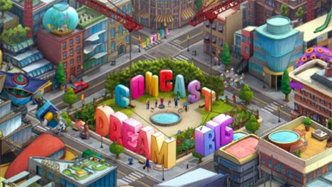
Smith & Foulkes - Comcast


Jonny Kelly - The Seed

Mitch Walker - Portfolio Review

My 2nd interview on the 25th Feb was with a freelance director called Mitch Walker who has been in the industry for many years and worked on lots of high profile advertising campaigns. After introducing myself again I showed him my work on the laptop in chronological order. He started with feedback on the Pole to Pole title sequence by saying that he thought after seeing the other work this was definately the weakest piece and explained that something he tells a lot of students and graduates is; when you are designing something for tv, you should carefully consider your layout and composition, because, as your sat at your computer working on it you are viewing it all the time at a matter of 15-20 inches away from the screen! whereas watching the tv sat in your living room you are usually a good few feet away from it! he said this was a key flaw on my title sequence because up close you can read the text that appears on the page but from further away you almost certainly woudnt make it out. I think this is a very valid criticism and something I didnt really think of at the time of making it. He also went on to talk about my Tomorrows world advert by saying that he thought it seemed a bit long and that this was because it is all one long shot, coming from an advertising background he said that a snappy re-edit would really improve the piece and break it up abit. Again I think this is very true as it was something I tried to overcome when making the piece (which is why I used the semi-3d sections to try and break it up abit).
We went on to talk about getting a job in the industry and how to get noticed, his opinion was (which is quite contrasting from other professionals i have spoken to) to try and give people a print version of my work or a disk with my reel on it, that could be handed to people or sent in the post to studios, which would perhaps just have some still shots of my work and a link to my website and other contact details. I think this is a good idea but was thinking more along the lines of business cards that I can hand to people with web address etc on it, because quite a few professionals say that they get sent hundreds of disks and cant be bothered playing them, because its much easier to click on a link and view your work online.
Overall I liked Mitch, he seemed to be bold enough to give an honest opinion and some decent advise rather than just saying that they look nice! I think I will take pole to pole out of my portfolio for now and in future to remember the target audience a bit more. He ended with saying overall he liked my work and thinks I could do well in the industry, and that he wanted to stay in touch.

Brenden Dawes - Portfolio Review


On 25th February I attended the D&AD portfolio surgery sessions at the Urbis gallery in Manchester. My first interview was with creative director Brenden Dawes from the Manchester based company Magneticnorth. When I went in I introduced myself and explained where i had come from and where I intend to go, which was good because I had not had any contact prior to the interview to talk to him. I began to show him my work which I had brought on a laptop and showed him my earliest piece first, my joint collaboration called 'Pole to Pole', then showed him my museum mini site, my nandos game, dave ident and finally my Tomorrows world ad. After seeing my work he gave me a bit of feedback by saying that he thought all of the pieces were nice, but as he was coming from a mainly interactive background he was most interested by my 2 flash pieces. He said that my animation (tomorrows world) was probably my strongest piece and after a bit of discussion advised that animation/moving image is probably the best avenue for me to persue as I said that I have started to really enjoy that aspect of my work. He explained that as a company they probably wouldnt be much use to me as they mainly specify in interactive/web work which I saw as a polite way of saying that he wasnt interested in giving me a job, which was fine as I wasnt expecting him to, but he said to stay in touch anyway. I think overall it went relatively well and I think that perhaps knowing that he was an interactive worker I should have focused on showing him that sort of work.

Saturday 14 March 2009

Tal Rosner Lecture


Tal Rosner is an award winning designer and filmmaker who recently came to Stockport College to give a lecture. He started off telling us about where he started from which was doing a BA degree in graphic design where he learned about composition and magazine layout design. Although he enjoyed this he decided he had a nack for rhythm and moving image and so went and did a MA course at Central Saint Martins (London) where he graduated in 2005 producing the film 'Doppelganger' as his major project


Doppelganger is a 4 minute long video that he describes as a '
daydream travel between real and imaginary, steel and concrete, clouds and smoke.' It uses footage from took from Londons Docklands area shot from on a train, (Rosner explained the potential of filming from moving trains later on in the lecture saying that it acts as a free dolly!) the video has lots of fantastic shots beautifully edited to an electronic beat, he uses a sort of kaleidoscope effect alot and said that he wanted every single frame to look like a piece of art if you paused it. I really like this piece and I can see definate influence in his work from Michel Gondrys Star Guitar. Rosner actually said that Doppelganger was the first piece of work that he produced that he thought was to a professional standard.
After his MA he got a job in London that he thought would be his dream job, but when he got there he found that he didnt like it as much as he'd hoped to have more creative freedom instead of just being told to do something a certain way.
After this he teamed up with 2 French classical pianists who asked him to work on a cd/dvd combo for there album, they wanted to give it a more modern feel to it so it would apeal to younger listeners and, after seeing Rosner's previous work, thought he was perfect for the job. Again he used footage from a moving train but went alot more abstract with it, and really shows the pace of the music.
The next piece of work he showed us was 'Debussy en blanc et noir' which he used lots of different footage and replaced, edited and speeded up parts of the footage to make it more interesting. I really liked this piece especially the replacing the sky with different footage as I think this can change the entire mood of a shot and I also have a fascination with sky and clouds!

Rosner then moved on to talk about the BAFTA award winning Skins title sequences that he did and explained that the producers of the program had seen his Stravinsky work and thought that it could work well in a more commercial place. He explained that he wanted to show the characters not the actors in the title sequences and also because skins focuses on a different particular character each episode he decided to do each one slightly different showing more of that character than the others. For series 2 he changed them slightly using the shapes of the letters as the transitions which works really well.


Finally he showed us his favourite and most recent piece he had produced called 'Without you' which was inspired by a poem by Joseph Albers; "Calm down, what happens, happens mostly without you" The video is very abstract using footage of unusual architectural designs and shapes and edited with shapes and colours that are similar to them.
Tal Rosner, I think, is a very talented designer/filmmaker and overall was very impressed with his lecture, he had a few slip ups during the presentation like forgetting where he was up to and talking about because he didnt have a set presentation planned out, but I think that didnt matter as his work speaks for itself. He explained that music influences his work and his edits a great deal and I think this shows through in his work and has moulded his own distinctive style. Overall I have learned quite a bit from his lecture, the two main points I found where that I should investigate sound alot more in my work and also that moving image/ motion design can be applied to all sorts of things not just modern commercials or animations, I think this would be something to look into further.