Friday 20 February 2009

Guilherme Marcondes - British Gas Advert


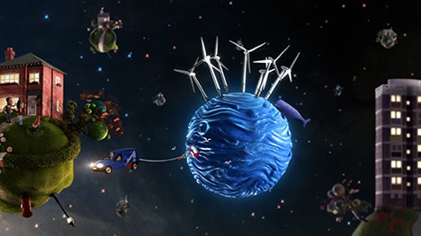
This is the new british gas commercial from acclaimed director Guilherme Marcondes from the agency Hornet. It is trying to promote the fact that they have invested into renewable energy sources and in particular the worlds largest off shore wind farm. When I first watched this I thought that it was brilliant and that it must have been produced in 3d, but after watching and reading the making of articles on Marcondes' page I found that the planets were actually hand crafted models shot on a green screen, then composited the animation over the top. I really like the way this has been produced and I think the little universe that they have created looks great, I especially like the fact that you can see they have used photos for the character faces and manipulated into a charicature style. The concept of youre home is your world really works well for the subject matter of the advert and also the 'windfarm planet' was created frame by frame in stop motion to produce the waves. Overall a lovely advert and I think this may influence the techniques i use for my FMP.
Watch The Video Here

Wednesday 11 February 2009

Reality Hack: Hidden Manchester


The second exhibition I wanted to go and view was the Hidden Manchester Exhibition by photographer Andrew Brooks, which documents his findings of spaces usually cut off from everyday sight or inaccessible to the public. His works are all very dark dingy places like in the sewers or abandoned underground amenities or the top of a church looking out over the city. The use of lighting is fantastic in his work as he manages to capture lots of eery colours and reflections which are very hard to work out where they have come from. I really like the exhibition he has produced and think that 'Urban Exploring' (which Brooks refers to it as) is really interesting and a great subject not just for photography but maybe for moving image aswell.
To see more of his work go to www. andrewbrooksphotography.com

Pencil - 45 Years Of Creativity From D&AD

This week I have visited the Urbis Gallery in Manchester as there was a few exhibitions I wanted to look at, the first, was the D&AD Pencil exhibition. This was showcasing the best pieces of design work to feature in the 45 years of the competition. All the work shown had either won a black or yellow pencil and was positioned next to the cover of that years annual. Although all the entries on show were fantastic and very inspirational what I found most interesting was the cover designs of all the D&AD annuals from every year dating back to 1963, they are all very interesting and innovative and some are quite 'out of the box' for example the Cover of the 2003 Annual was designed by Nick Crosbie and has big white suckers all over it so that you can stick it to things! and Malcolm Gaskin’s marvellous 1984 ‘blow-up’ cover included a valve that allowed the blind embossed, heat sealed, translucent dust jacket to be inflated, which is very imaginative and fun!


Each year the cover is designed by a different aspiring creative chosen by D&AD and has become an award in its own right to be chosen as thousands of designers will see it and have their own criticisms and judgements. Of recent years the design has tended to stick to the main company colours of yellow and black but back at the beginning of the organization it was alot more open. These were the first 3 annuals ever brought out (below), The first was by designer Alan Fletcher who simply took a photo of his old portfolio that he used to carry his own work about in, and stuck a D&AD logo on the handle, very simple yet effective whereas 1964's shows a red apple in the middle of lots of green ones, possibly an analogy or a metaphor for standing out from the crowd.